Redesigning Geography AS Notes
Just under a month ago, I wrote about which projects I’d be focusing my time on in the coming year. The main takeaway from the post was that Geography AS Notes was going to get some love. Well, here’s my first packet of love1, a redesign.
It’s been nearly two years since I last refreshed Geography AS Notes’ design and in that time its grown boring and stale. The website’s design has never been eye catching—one frequent piece of feedback I get is that the site is boring to look at—but for the past two years I’ve taken the function over form approach. This needed to change.
If a site is boring to look at, the reader is more likely to perceive the content as boring which isn’t good if you want them to study using it. Furthermore, I’ve realised that Helvetica (or Arial on Windows) ins’t a good body font and my choice of font was hurting the legibility of the site, a problem that grew worse with the length of articles.
For the redesign, I wanted to make something that not only looked half decent but was comfortable to read on a multitude of devices. In addition, I wanted to simplify the site’s markup and make use of the new HTML5 semantic elements to improve accessibility, something which is very important when you’re dealing with people’s education. Finally, I wanted to make it easier for people to find content on the site by implementing site search. These were the four main objectives when redesigning the website.
The first objective I worked on was improving the HTML semantics. This didn’t
take too long and drastically simplified the site’s markup. I found a fantastic
new method for writing CSS sticky footers. By using it I
was able to eliminate lots of un-semantic wrapper styles and layout my pages
with just the <header>, <article> and <footer> elements. The new CSS
sticky footer doesn’t work in IE <= 7 but nobody uses that anymore.
Speaking of IE, I raised my minimum target from IE 7 to 82. I was surprised
by how painless it was developing for IE 8. All I needed to do was drop in
html5shiv.js and there were no further problems. I’ve
actually had more problems with IE 9/10/11 and their funky way of resizing
<img> elements with SVG content (which I still haven’t fixed).
With the site’s structure modernised, I started working on how the site looks. I opted for a dark colour scheme with splashes of orange. I think it looks good and it’s much better than the old design. Article headers receive more emphasis than they used to while the site’s header is less dominant to focus on the content. The new design is more fluid than the old one, relying less on media queries and making extensive use of % dimensions. This kept the SCSS clean.
I made some significant changes to the homepage. Previously, the homepage used
a set of expanding divs that contained the site’s content. It looked sort of
cool but didn’t work well on small screens and content was often truncated
since I couldn’t use height:auto on the divs and have CSS3 transitions work.
In the new design, a (pseudo) segmented control is used to control the visible
topic. This works better on mobiles and doesn’t have any problems with
truncated content as I’m only toggling the div’s (well, <section> now)
visibility and display properties.
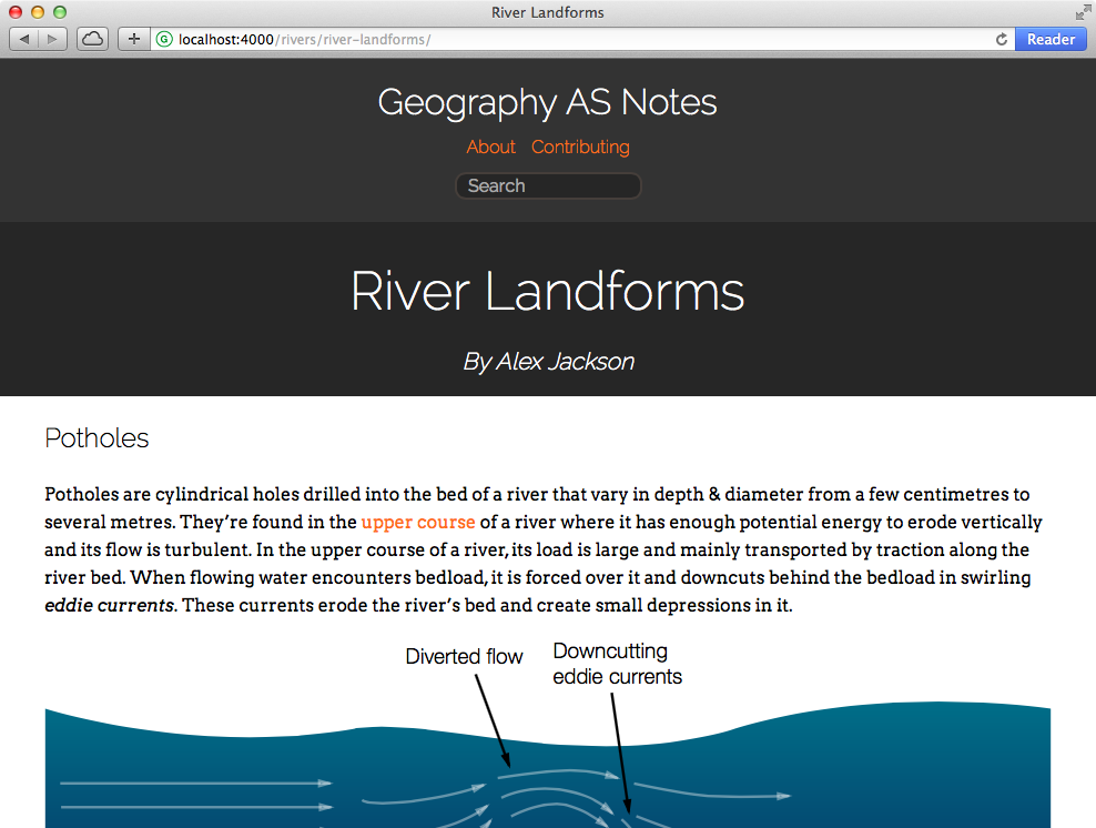
The next objective to strike off was legibility. I played around with a few font combinations from Google Fonts and ended up combining Arvo and Raleway. Arvo—a slab-serif font—is used for the site’s body while Raleway—a sans-serif font—is used for headers. I like the combination, they look nice together and, most importantly, they’re highly readable.
The final objective was search. Most people arrive at Geography AS Notes using Google but once they’re on the site, there’s no further search functionality. Since the site’s Jekyll powered, implementing search has a few challenges. Mainly, it needs to be handled client-side. I toyed with writing a search engine back in January last year. It worked—surprisingly efficiently may I add—but it needed a lot of work and I never got around to finishing it.
I tried again to implement client-side site search, this time using lunr.js so I didn’t have to handle the actual searching. Lunr.js is simple to set up but, in my limited testing, it proved too slow at indexing full text content for every page. It was unreasonable of me to expect it to handle such a large index but it was worth a shot.
Ultimately, I offloaded site search to a third party service. I tried Tapir but the service seems to have shut down3. I ended up using DuckDuckGo which offers some limited customisation of the search results. It’s a compromise though—I’d much rather have results on my website.
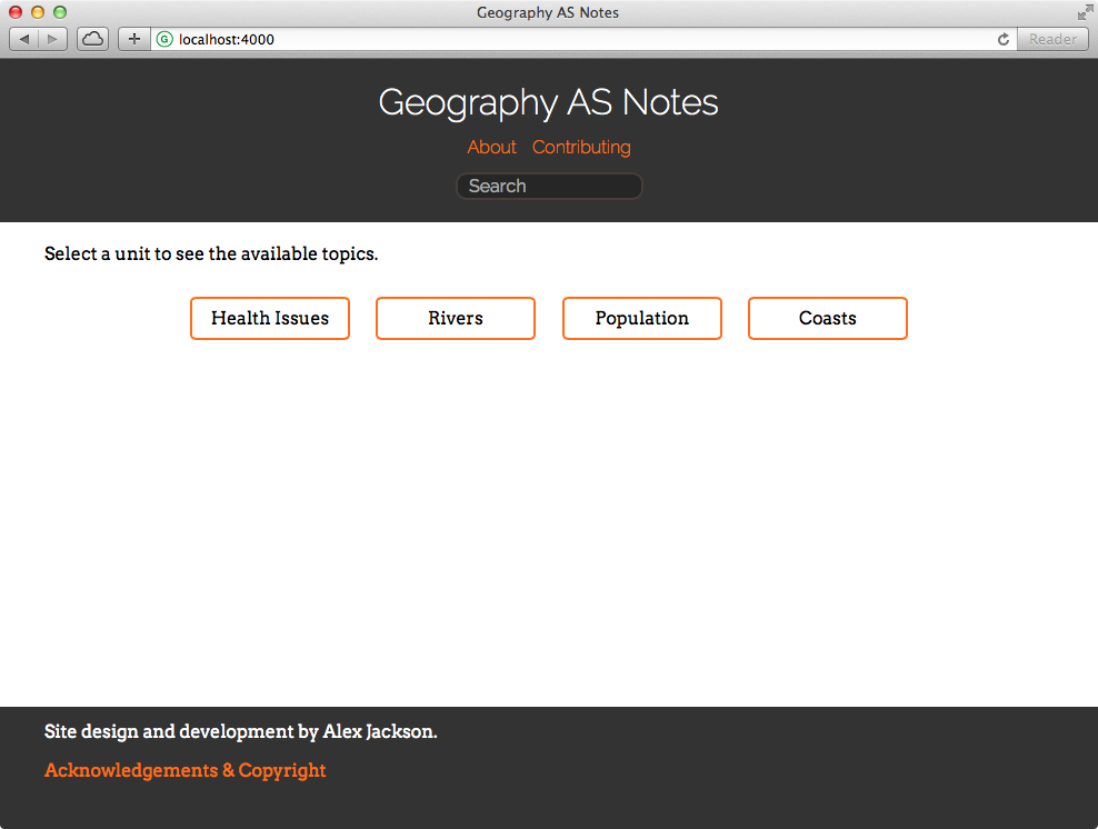
The final design ended up looking like this:
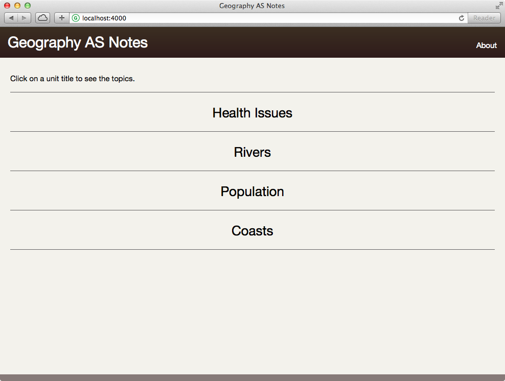
For reference, the old design:
I made a few smaller changes while working on the redesign. All the topics now have their own page which can be linked to. In addition, I’ve made it more obvious that people can edit existing articles and create new ones. All articles have an edit link in their footer and I’ve written about other ways people can contribute.
This redesign is just the first in what I hope is a string of updates to Geography AS Notes that will be coming throughout the year. If you have any suggestions for the website, let me know via the GitHub repository.
It’s quantum love, coming in discrete packets. ↩︎
I’d like to raise it higher than this but a lot of schools—where the website’s most commonly accessed from—still use IE 8. ↩︎
I never received an email with my private API key and received no response from the API with the public key when I tried to use it. ↩︎